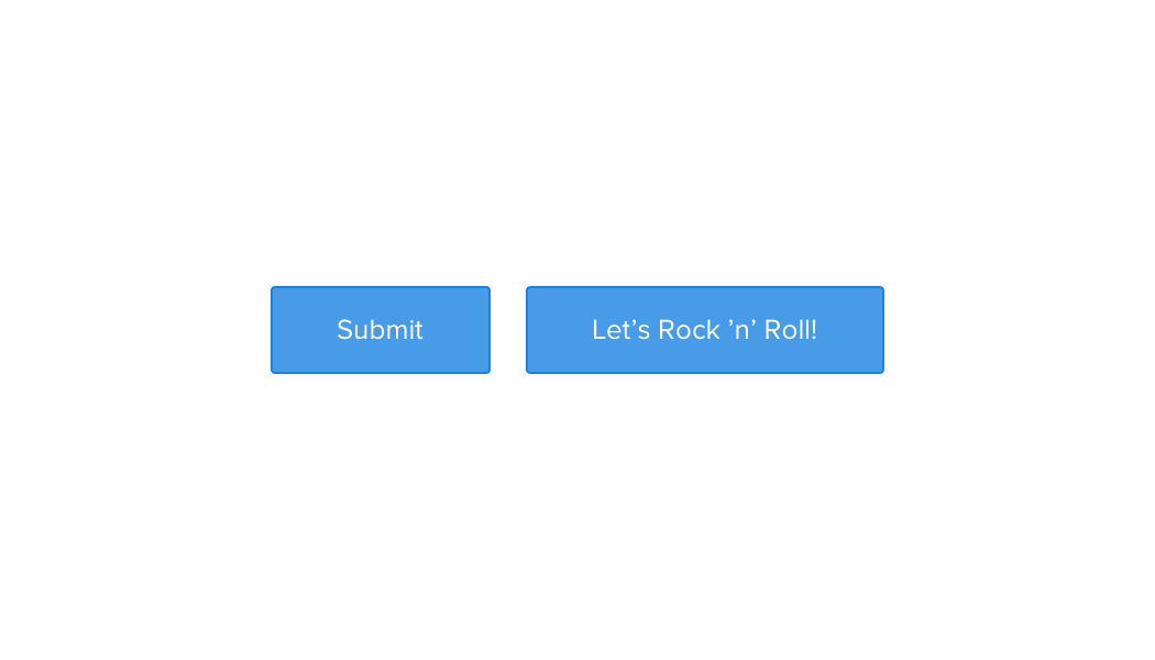
Buttons

Buttons are used to signify actions the user can take. Use primary buttons as happy path actions, such as confirming, saving, or creating. Secondary buttons should be used for alternative actions, such as saving or cancelling. Danger buttons should only be used when the user is performing an action that is irreversible. Toggles are typically used for transforming the scope or format of data. For example, viewing data by day/week/month, or numbers vs percentages.

Standard

Containers .btn-list
Required .btn
Modifiers .btn-primary .btn-secondary .btn-danger .has-icon .has-badge
States .is-disabled .is-loading

Guidelines

  • Labels should be title case and ≤ 20 characters.
  • Labels should be action-oriented and describe the action to be performed.
  • Primary buttons should be placed to the right of secondary buttons.
  • Primary buttons shouldn't be placed beside each another.
  • Avoid placing three buttons beside each another.
  • Only use the .btn-danger class for irreversible actions where the user stands to lose a lot of work.
Don't use vague button labels.
Don't place two primary buttons adjacent to one another.

Small

Containers .btn-list
Required .btn .btn-small
Modifiers .btn-primary .btn-secondary .btn-danger .btn-on-dark .has-icon .has-badge
States .is-disabled .is-loading

Save

Containers .btn-list
Required .btn .btn-save
Modifiers .btn-primary .btn-secondary
States .is-loading .is-saved

Dark

Containers .btn-list
Required .btn .btn-on-dark
Modifiers .btn-primary .btn-secondary .btn-danger .has-icon .has-badge
States .is-disabled .is-loading

Toggle Buttons

Day
Week
Month
#
%
Containers .btn-list .btn-group
Required .btn .btn-group-item
States .is-active .is-disabled

Guidelines

  • The labels should be title case and ≤ 15 characters long.
  • Labels should be semantically parallel.
  • Use toggles to swap between different views of the same data.
  • For showing boolean state—e.g. on / off—use a switch or a checkbox.
Don't use non-parallel labels.
Don't use a toggle for a switch.