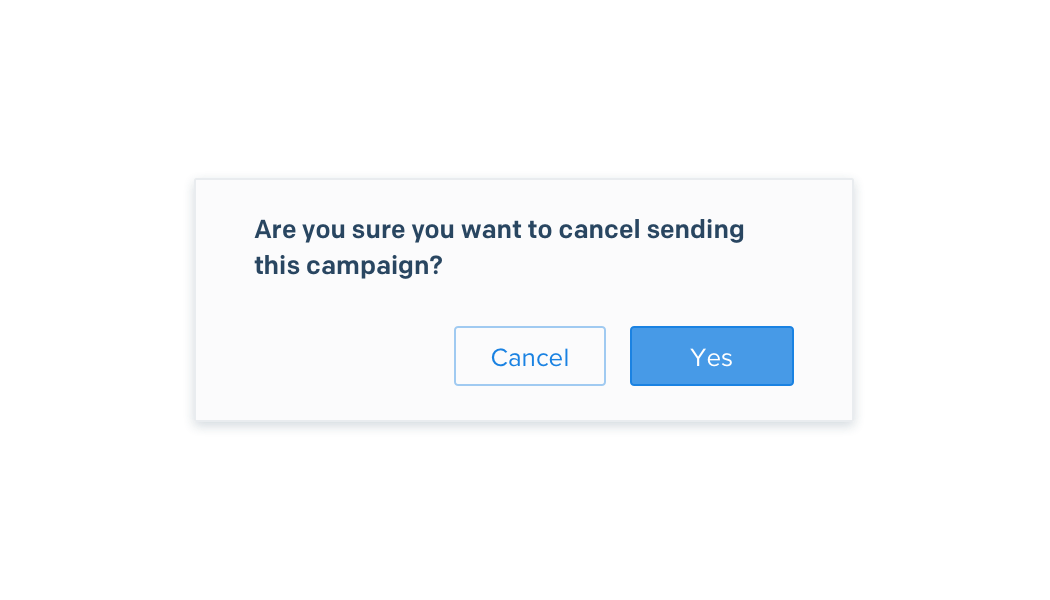
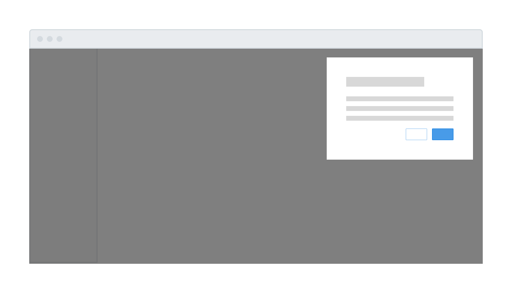
Confirmation
Are you sure you want to delete these workflows?
Lorem ipsum dolor sit amet, consectetur adipiscing elit. In nec augue eu lacus aliquam lobortis
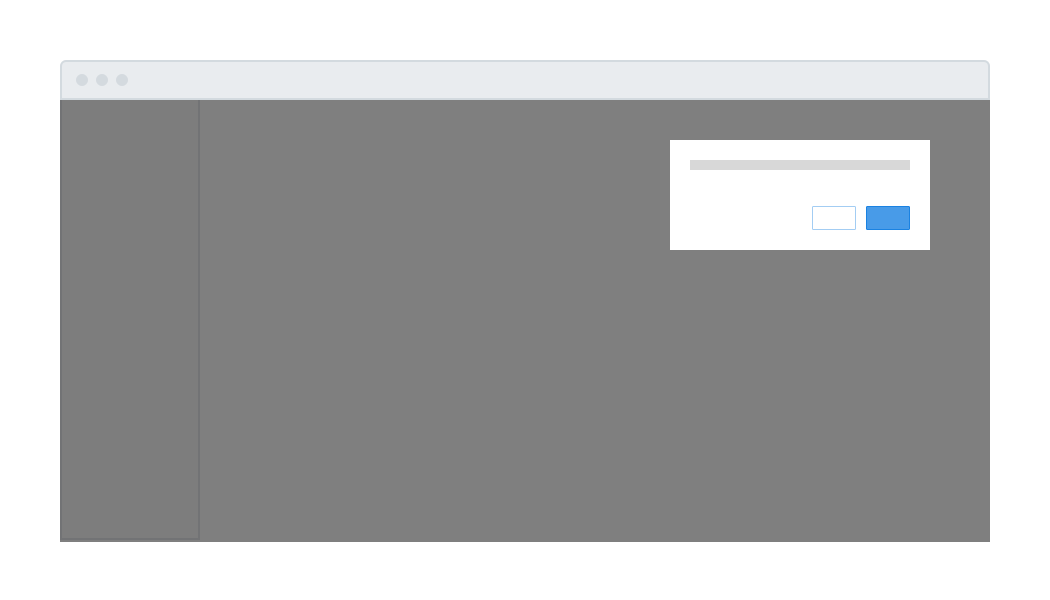
| Required | .center-modal .is-confirmation |
| HTML Elements | div.modal-mask |
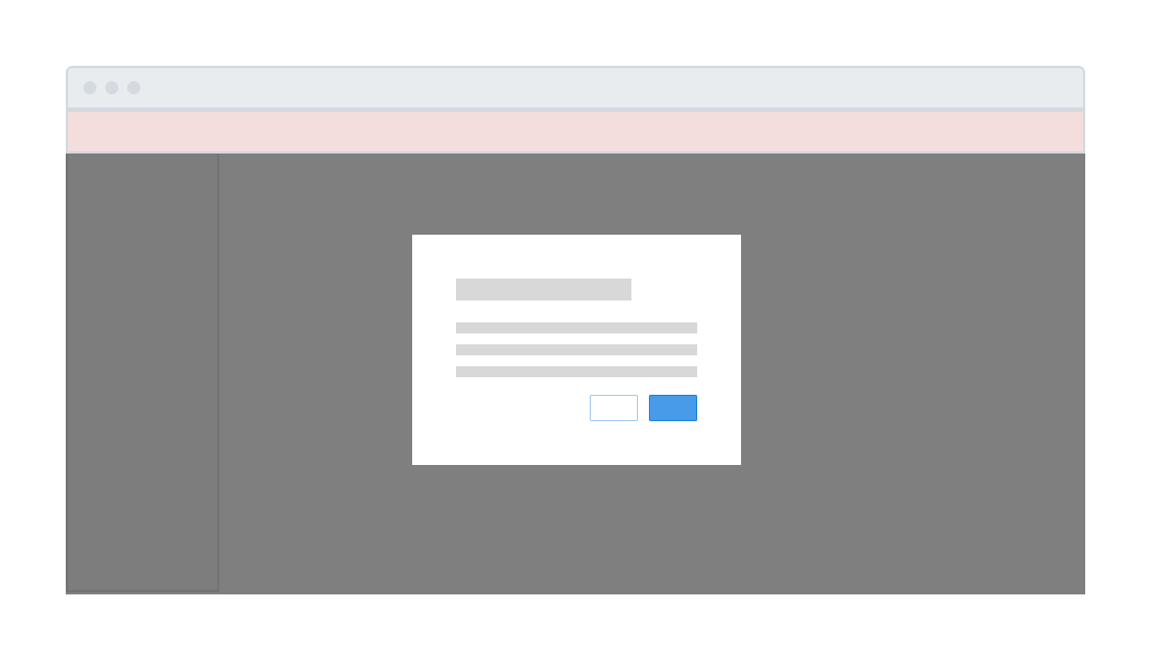
Guidelines
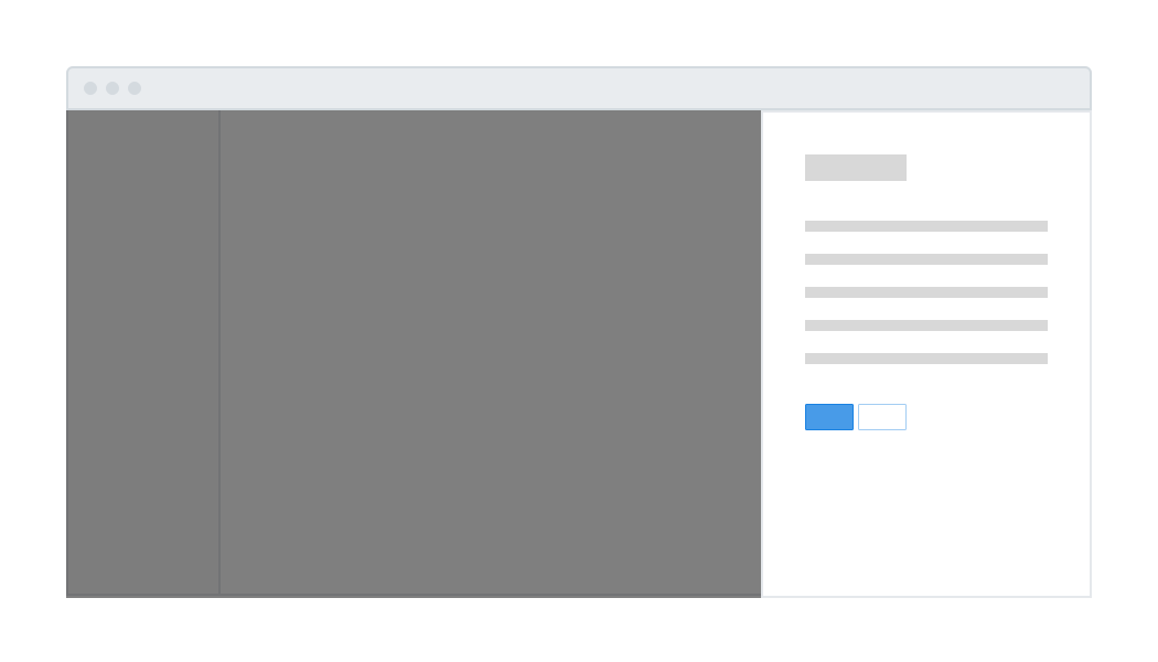
- Title should be sentence case and ≤ 50 characters.
- Body content should use complete sentences and be ≤ 200 characters.
- Interrogative statements must have a question mark. Declarative statements may omit a period.
- When a modal is open, body scrolling should be disabled using body.modal-open.
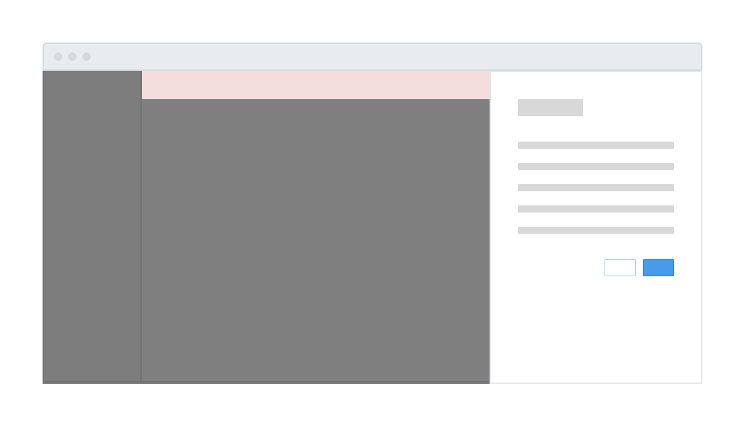
- Action buttons should appear at the bottom. Place one primary button flush right and up to one secondary button to its left.
- Clicking on the grey scrim should not close the modal.