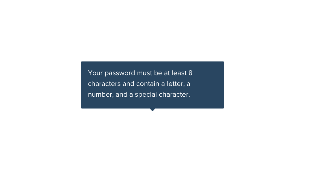
Tooltips

Tooltips are text bubbles that display when a user hovers over an abbreviation or info icon. Tooltips help reduce clutter within the interface and hides helpful hints and information for the user until it is needed. Style Guide provides a pure CSS solution and a JS alternate for HTML tooltip content, such as headlines or links.

Standard

Tooltip Up

Tooltip Right

Tooltip Down

Tooltip Left

Container(s) [data-tooltip]
Modifiers [data-tooltip-pos="up"] [data-tooltip-pos="right"] [data-tooltip-pos="down"] [data-tooltip-pos="left"]
States [data-tooltip-length="small"] [data-tooltip-length="medium"] [data-tooltip-length="large"] [data-tooltip-length="xlarge"]

Guidelines

  • Text should be complete sentences and ≤ 140 characters.
  • Before using a tooltip, ask first whether the design or nomenclature can be changed.
  • Only use tooltips for non-critical information.
  • Pick a tooltip orientation using the following order: up, right, left, down.
  • Use "Learn more" links when further explanation is warranted. See JS Tooltips below.
  • Use the underlined style when you need a more subtle treatment.
Don't use tooltips to communicate must-see content.
Don't put too much content in a tooltip.

Underline

Tooltip Up
Tooltip Right
Tooltip Down
Tooltip Left
Container(s) [data-tooltip]
Required .has-underline
Modifiers [data-tooltip-pos="up"] [data-tooltip-pos="right"] [data-tooltip-pos="down"] [data-tooltip-pos="left"]
States [data-tooltip-length="fit"] [data-tooltip-length="small"] [data-tooltip-length="medium"] [data-tooltip-length="large"] [data-tooltip-length="xlarge"]

HTML Content

The CCV number is a 3 or 4 digit security code printed on the front or back of your card.

The CCV number is a 3 or 4 digit security code printed on the front or back of your card.

Container(s) .tooltip-js-content
Required .tooltip-js-parent
States .is-hovered .is-visible .is-left [data-tooltip-length="small"] [data-tooltip-length="medium"] [data-tooltip-length="large"] [data-tooltip-length="xlarge"]