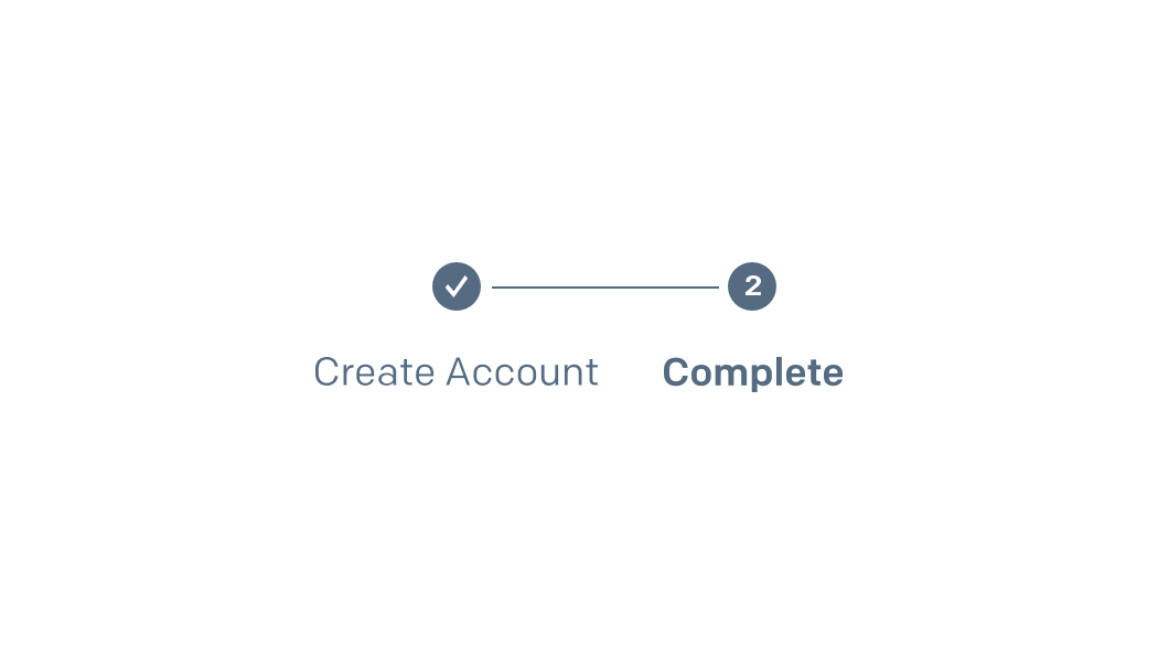
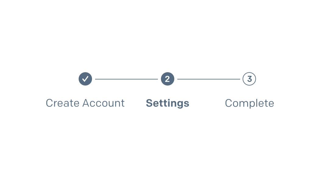
Progress & Activity

Progress and activity components are visual indicators that help inform the user of their movement through our product. These can take the form of stepped indicators, loading icons, meters, and pagination.

Horizontal

Container(s) .progress-container
Required .progress-stages
States .is-done .is-selected
<div class="progress-container">
<ul class="progress-stages">
<li class="is-done"><label>Transactional</label></li>
<li class="is-selected"><label>Marketing</label></li>
<li><label>Engagement</label></li>
<li><label>Success!</label></li>
</ul>
</div>

Guidelines

  • Text should be title case and ≤ 30 characters.
  • Only use where there are ≥ 3 and ≤ 9 steps.
  • Keep labels semantically parallel.
  • Completed steps should allow users to return to them when clicking that step label
Don't use when there are too few or too many steps.
Don't use incongruous labels.

Vertical

Container(s) .progress-container
Required .is-vertical .progress-stages
States .is-done .is-selected
<div class="progress-container is-vertical">
<ul class="progress-stages">
<li class="is-done"><label>Transactional</label></li>
<li class="is-selected"><label>Marketing</label></li>
<li><label>Engagement</label></li>
<li><label>Success!</label></li>
</ul>
</div>

Breadcrumbs

Required .breadcrumb
<ol class="breadcrumb">
<li><a href="#">Setup Guide</a></li>
<li>Integrate using our Web API or SMTP Relay</li>
</ol>

Guidelines

  • Segments should be title case and ≤ 15 characters.
  • When the last segment represents the current page, do not link it.
  • You may omit the last segment if it's redundant with the page title.
  • Avoid using "Back", except in situations where the previous page may not be known.
Don't use "Back" unless the previous page's title cannot be determined.

Pagination

Container(s) .pagination .pagination-links
Required .pagination-link
States .is-active
HTML Elements a.pagination-prev a.pagination-next
<div class="pagination">
<a class="btn btn-secondary btn-small pagination-prev">Prev</a>
<div class="pagination-links">
<a class="pagination-link">1</a>
<a class="pagination-link is-active">2</a>
<a class="pagination-link">3</a>
<a class="pagination-link">4</a>
<a class="pagination-link">5</a>
<a class="pagination-ellipses">&hellip;</a>
<a class="pagination-link">42</a>
</div>
<a class="btn btn-secondary btn-small pagination-next">Next</a>
</div>
view raw pagination.html hosted with ❤ by GitHub

Guidelines

  • Pagination should only be placed at the bottom of tables.
  • Omit pagination when there is only one page of results.
  • Pagination should follow the following rules.
Don't show pagination if there is only one page of results.
Don't show all pages when the number of pages is greater than 6.

Pie Chart

Good
64%
  • 45% passed
  • 12% failed
  • 6% not received
Overall Deliverability
Average
64%
  • 45% passed
  • 12% failed
  • 6% not received
B2B Deliverability
Container(s) .card
Modifiers(s) .is-centered .pie-chart-card
Required .pie-chart .badge .pie-chart-svg SVG .pie-chart-legend data-tooltip
States .badge.mantis .badge.carrot
<div class="card is-centered pie-chart-card">
<span class="badge mantis">Good</span>
<div class="pie-chart">
<div class="pie-chart-svg">
<svg width="100%" height="100%" viewBox="0 0 42 42" class="donut">
<circle class="donut-hole" cx="21" cy="21" r="15.91549430918954" fill="#fff"></circle>
<circle class="donut-ring" cx="21" cy="21" r="15.91549430918954" fill="transparent" stroke="#9e9e9e" stroke-width="2"></circle>
<circle class="donut-segment" cx="21" cy="21" r="15.91549430918954" fill="transparent" stroke="#18c96e" stroke-width="2" stroke-dasharray="60 40" stroke-dashoffset="0"></circle>
<circle class="donut-segment" cx="21" cy="21" r="15.91549430918954" fill="transparent" stroke="#b71c1c" stroke-width="2" stroke-dasharray="20 80" stroke-dashoffset="45"></circle>
<circle class="donut-segment" cx="21" cy="21" r="15.91549430918954" fill="transparent" stroke="#9e9e9e" stroke-width="2" stroke-dasharray="25 75" stroke-dashoffset="25"></circle>
</svg>
<span class="pie-chart-number is-size-h2">64%</span>
</div>
<ul class="pie-chart-legend">
<li>
<span class="label label-delivered">45% passed</span>
</li>
<li>
<span class="label label-error">12% failed</span>
</li>
<li>
<span class="label label-draft">6% not received</span>
</li>
</ul>
</div>
<span class="has-underline is-size-h2" data-tooltip="Tooltip down!" data-tooltip-pos="down">Overall Deliverability</span>
</div>
view raw pie-chart.html hosted with ❤ by GitHub